| 일 | 월 | 화 | 수 | 목 | 금 | 토 |
|---|---|---|---|---|---|---|
| 1 | 2 | 3 | 4 | |||
| 5 | 6 | 7 | 8 | 9 | 10 | 11 |
| 12 | 13 | 14 | 15 | 16 | 17 | 18 |
| 19 | 20 | 21 | 22 | 23 | 24 | 25 |
| 26 | 27 | 28 | 29 | 30 | 31 |
Tags
- 파이썬
- c#
- 윈도우10
- 텐서플로우
- matplot
- oracle
- MSSQL PYTHON
- 딥러닝
- Python
- MSSQL
- Visual Studio Code
- tensorflow
- 장고
- pymssql
- rs422
- 크롤링
- PYTHON MSSQL
- MX Component
- M2M
- 오라클
- Serial
- windows10
- sql developer
- MEAN Stack
- vscode
- django
- 티스토리 초대장
- scrapy
- rs485
- 자본주의
Archives
- Today
- Total
안까먹을라고 쓰는 블로그
[Python] MSSQL 연동 (feat. 내 생일의 기온 그래프 그리기) 본문

반응형
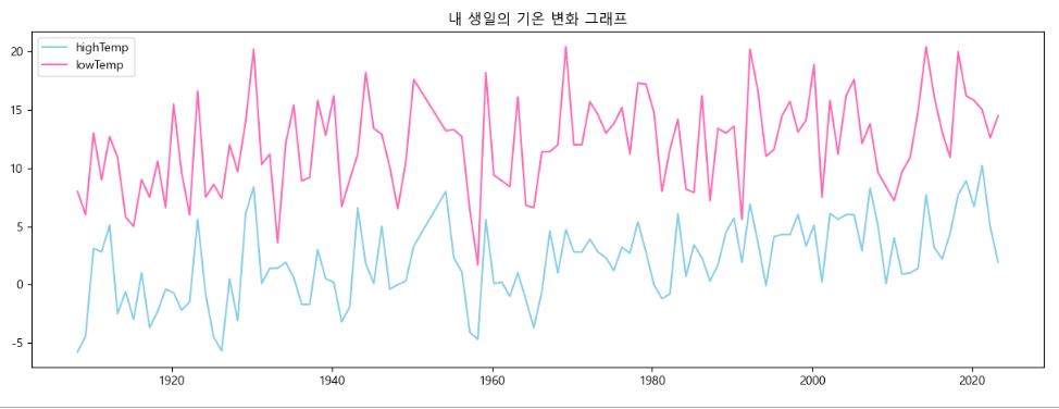
아래의 MSSQL에 저장 된 온도 데이터를 조회하여, 내 생일의 최고/최저 기온을 matplot 라이브러리로
그래프 그리기
PYTHON 소스
import pymssql
import matplotlib.pyplot as plt

server = '192.168.0.2'
database = 'DZ'
username = 'sa'
password = 'pwd'

#############################################################################
# MSSQL 접속
conn = pymssql.connect(server, username, password, database)
# auto commit 을 사용할 경우 : conn.autocommit(True)
cursor = conn.cursor()

#############################################################################
# SELECT
cursor.execute('select *  from tblTemp where right(convert(char(8), Date, 112), 4) = ''0327'' ' +
               ' and LowTemp IS NOT NULL and HighTemp IS NOT NULL order by Date asc')
list = cursor.fetchall()
result_Date = []
result_Low_Temp = []
result_High_Temp = []

for row in list:
    result_Date.append(row[0])
    result_Low_Temp.append(float(row[3]))
    result_High_Temp.append(float(row[4]))
print(result)

plt.rc('font', family='Malgun Gothic')          # 맑은 고딕을 기본 글꼴로 설정
plt.rcParams['axes.unicode_minus'] = False     # 마이너스 기호 깨짐 방지
plt.figure(figsize = (15, 5))                   # 그래프의 사이즈 지정 (가로-15인치, 세로-5인치)
plt.title('내 생일의 기온 변화 그래프')         # 제목설정
plt.plot(result_Date, result_Low_Temp, 'skyblue', label = 'highTemp')
plt.plot(result_Date, result_High_Temp, 'hotpink', label = 'lowTemp')
plt.legend()
plt.show()
결과 값
끝~
반응형
'Language > Python' 카테고리의 다른 글
| [PYTHON] 현재 환경의 패키지 백업 및 한번에 설치 (0) | 2023.10.30 |
|---|---|
| [Python] MSSQL 연동 (feat. csv파일 mssql에 저장하기 - 2) (0) | 2023.05.29 |
| [Python] MSSQL 연동 (feat. csv파일 mssql에 저장하기 - 1) (0) | 2023.05.29 |
| [Python] MSSQL 연동 (Feat. pymssql) (0) | 2023.05.29 |
| [Python] 주식데이터 분석 (0) | 2023.04.04 |
'Language/Python' Related Articles
more


Comments